
The real-time visibility tool that transforms one-time projects into five-year partnerships.
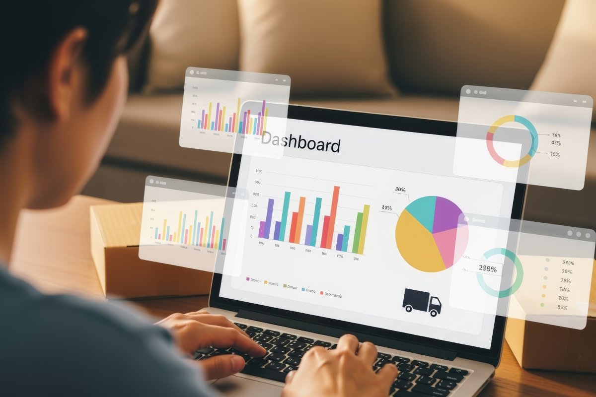
The Dashboard That Created a Five-Year Partnership
Lisa delivered a customer service training programme. Standard project, well-executed, good results.
Then she did something most instructional designers never do: she built a live dashboard.
Not a one-time report. A living, updating dashboard the client could check anytime.
What it showed:
- Current team performance scores
- Week-over-week trends
- Knowledge retention rates
- Application confidence by employee
- Correlation with customer satisfaction metrics
First month: client checked it weekly. Second month: client shared it with their boss. Third month: dashboard featured in board presentation. Fourth month: Lisa’s contract expanded to three other departments. Year one: £85,000 in total revenue from that one client. Year five: still on retainer, total relationship value £340,000+.
What changed? The dashboard made Lisa’s value visible every single day. Not just at project completion – continuously.
Why Dashboards Create Dependency

Reports are consumed and forgotten. Dashboards are visited and relied upon.
Traditional report:
- Delivered once
- Read once (maybe)
- Filed away
- Forgotten
Live dashboard:
- Always available
- Checked regularly
- Shared with stakeholders
- Becomes essential
The psychology:
- Week 1: “This is helpful.”
- Week 4: “I check this every Monday.”
- Week 8: “My boss asks about these numbers.”
- Week 12: “I can’t imagine managing without this.”
When something becomes part of someone’s workflow, removing it feels like losing a critical tool.
That’s how you become indispensable.
The Three Essential Dashboards
Dashboard 1: Executive Overview
Purpose: give leadership instant visibility into training ROI. Who uses it: C-suite, VPs, directors. Update frequency: weekly or monthly.
Key metrics (4–6 maximum):
1. Training ROI (one big number)
Current: 287% ROI (£340,000 value from £118,500 investment)
2. Business impact KPIs
Customer satisfaction: 87% (↑9 points since training)
Support ticket resolution: 6.2 hours (↓2.1 hours)
First-call resolution: 79% (↑15 points)
3. Trend lines (visual)
- Performance over time graph
- Before/after comparison
- Goal vs. actual progress
4. Strategic progress
Q4 capability goals:
- Customer Service Excellence: 94% complete
- Advanced Product Knowledge: 67% complete
- Leadership Development: 12% complete
5. Risk indicators
- Knowledge decay detected in Q2 cohort (recommend refresher)
- All compliance certifications current
Design principles:
- One page only
- Big numbers with context
- Minimal text
- Traffic-light colours (green/amber/red)
- Updates automatically
Why executives love this:
- Answers their questions instantly
- Suitable for board presentations
- Demonstrates L&D business value
- No hunting for information
Dashboard 2: Manager Operations View
Purpose: give frontline managers actionable performance intelligence. Who uses it: team leaders, department heads, managers. Update frequency: daily or weekly.
Key metrics:
1. Team performance breakdown
Team average: 84%
Top performers (>90%): 12 employees
Needs support (<70%): 4 employees
2. Knowledge gap identification
Strongest areas:
- Safety Protocols: 94% mastery
- Quality Standards: 88% mastery
Development needed:
- Equipment Troubleshooting: 67% mastery
- Complex Problem Solving: 62% mastery
3. Individual performance tracker
Sortable table — example row:
Sarah J.: Overall 96% – on track
Mike T.: Overall 84% – monitor
Alex K.: Overall 68% – coach
4. Recommended actions
This week:
- Schedule 30-min workshop on troubleshooting for 8 team members
- Provide one-on-one coaching to Alex K. and 3 others
- Recognise top performers: Sarah J., David M., Lisa P.
This month:
- Plan refresher training for Q1 cohort (retention declining)
- Create peer mentoring pairs (high/low performers)
5. Trend analysis (vs. last month)
- Average performance: +3 points ↑
- Time to mastery: −1.2 days ↓
- Knowledge retention: +8 points ↑
Why managers love this:
- Tells them exactly what to do
- Identifies who needs help
- Tracks progress over time
- Saves hours of manual analysis
Dashboard 3: Continuous Improvement Tracker
Purpose: show content effectiveness and guide optimisation. Who uses it: you, L&D teams, instructional designers. Update frequency: after each cohort.
Key metrics:
1. Content performance
Most effective (>85% first-attempt mastery):
- Module 2: Safety Procedures – 94%
- Module 4: Customer Communication – 91%
Needs revision (<70% first-attempt):
- Module 3: Technical Specifications – 64%
- Module 5: Advanced Troubleshooting – 67%
2. Engagement patterns
Highest revisit rate:
- Safety videos (43% watched 2+ times)
- Quick reference cards (67% downloaded)
Lowest engagement:
- Text-heavy overview (12% time on page <30 sec)
- Compliance module (34% skipped optional content)
3. Common errors
Module 3 – Question 7:
- 78% answered incorrectly
- Common misconception: metric vs. imperial confusion
- Recommendation: add conversion calculator tool
Module 5 – Scenario 4:
- 71% skipped diagnostic checklist
- Recommendation: make checklist interactive/required
4. ROI of improvements
If Module 3 revised (estimated cost: £2,400):
- Expected mastery increase: +18 points
- Reduced post-training support questions: −30%
- Estimated annual value: £15,000+
- ROI of revision: 525%
Why instructional designers love this:
- Surfaces problems before clients notice them
- Quantifies the value of every improvement
- Turns design iteration into a paid service line
- Justifies revision budgets with hard numbers

Your Next Move
A static report ends a project. A live dashboard starts a relationship.
Build the three dashboards once. Connect them to your data source. Update them automatically. Your client checks them weekly, shares them upward, and stops thinking of you as a vendor – because you’re now part of the operating rhythm.
Ready to build dashboards that make you indispensable?
Connect Data Trackers to Google Sheets in minutes. Build dashboards that update themselves. No card, no time limit.
Start free